Portal Guide
CHAPTER 5
This chapter explains how to use portal themes to control the look and feel of an exteNd Director portal application. It contains the following sections:
A portal theme is a set of visual characteristics that apply to an entire exteNd Director portal application. Once you set the theme for a portal application, the settings associated with the theme apply globally. These settings can potentially change the appearance of portal pages (both PID pages and JSP pages) and portlets, as well as the appearance of personal, shared, and container pages. Themes provide a simple way to ensure a consistent appearance throughout a portal application.

exteNd Director ships with several predefined themes:
These themes are defined in the portal_core_resource.jar.
TIP: To preview these themes, display the theme tester page by entering the following URL in your browser:
http://host/project context/portal/pages/ThemeTester.html
A portal theme consists of several files:
|
File(s) |
Description |
|---|---|
|
Describes the theme. This file provides a display name, description, preview image file, and thumbnail image file for the theme. The theme descriptor file must be named theme.xml. Each theme used by a portal application must have a separate theme.xml file. |
|
|
Contains all of the attributes and properties that define the appearance of a theme when it is rendered at display time. The theme CSS file must be named theme.css. Each theme used by a portal application must have a separate theme.css file. See Theme style sheet. |
|
|
Define various images that are used by the theme. These graphics files are stored in a directory called images. |
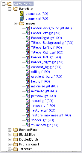
The theme.css and theme.xml files, and the images directory are all stored in a theme folder. The theme folder is a subdirectory of the portal-theme directory within a resource set. The name of the theme folder provides a key for the theme and uniquely identifies the theme.
For example, here is what the directory structure might look like for the BasicBlue theme:
 For more information about where files are located in a resource set, see the chapter on using the Resource Set in an exteNd Director application in Developing exteNd Director Applications.
You can create custom themes using the Portal Themes Wizard in the exteNd Director development environment, as described in the chapter on creating custom themes.
Each theme in your portal application must have a theme descriptor file called theme.xml. The theme descriptor file specifies the following information for the theme:
|
Element name |
Description |
|---|---|
|
portal-theme |
The root node of the portal theme. |
|
display-name |
The name used to identify the theme in the user interface of a portal application. |
|
description |
The description of the theme. |
|
preview-image |
An image showing what the theme will look like at display time. The theme selector displays preview images for each theme, as described in the section on setting the theme for your portal. The path to this image can be a fully qualified URL or an URL that contains portal replacement strings.
|
|
thumbnail-image |
A smaller image showing what the theme will look like at display time. This image is typically used in user interfaces listing available themes. The path to this image can be a fully qualified URL or an URL that contains portal replacement strings.
|
Here is the descriptor file for the BasicBlue theme:
  <?xml version="1.0" encoding="UTF-8"?>
  <!DOCTYPE portal-theme PUBLIC "-//SilverStream Software, LLC//DTD Portal Theme 5.0//EN" "portal-theme_5_0.dtd">
  <portal-theme>
    <display-name>Basic Blue</display-name>
    <description>Basic Blue theme, smooth plastic</description>
    <preview-image>$RESOURCE_URL$/portal-theme/BasicBlue/images/preview.gif
    </preview-image>
  <thumbnail-image>$RESOURCE_URL$/portal-theme/BasicBlue/images/thumbnail.gif
    </thumbnail-image>
  </portal-theme>
Each theme that ships with exteNd Director comes with its own theme.xml file, as described in Files associated with themes.
Each theme in your application must have a style sheet called theme.css. This file is a standard cascading style sheet (CSS) that will work in Netscape 6 and Microsoft Internet Explorer 5 (and higher versions). Each theme that ships with exteNd Director comes with its own theme.css file.
The style sheet defines a set of classes, some for exteNd Director styles and others for Java Portlet 1.0-compliant portlet styles. These styles can be used to alter the display of portal pages—and of the portlets and XForms 1.0-compliant Web forms that appear on portal pages.
You can create your own styles by defining new classes and editing the settings for the predefined exteNd Director styles.
To locate theme style sheets, see Files associated with themes.
Standard exteNd Director style definitions in theme.css files contain an nv- label.
There are several types of exteNd Director style classes, each designated by a unique prefix:
Here is a list of the predefined exteNd Director style definitions, grouped according to the types of display characteristics they alter:
exteNd Director also supports standard CSS classes defined by the Java Portlet 1.0 specification.
These classes are defined with the prefix .portlet, as in this example:
  .portlet-font {
    font-family : Verdana, Arial, Helvetica, sans-serif;
    font-size : 10pt;
  }
For a list and description of each style definition, see CSS Style Definitions in the Java Portlet 1.0 specification.
The styles defined for portlets give the theme developer a great deal of control over the runtime display of portlets on a page.
For details on using the portlet styles to theme-enable a portlet, see Creating portlets that are theme-enabled.
By convention, each of the standard exteNd Director style classes specifies values for a common set of HTML properties. However, a class definition need not specify values for all of the possible HTML properties normally associated with the class.
Some of the standard classes for the installed themes use a non-standard prefix to comment out certain property settings. When the browser sees a prefix that it does not recognize, it simply ignores the property. The following example uses a prefix x- to comment out the visibility property of the footer container style:
  .nv-footerContainer {
  	   x-visibility : hidden;
  	   font-size:2pt;
  	   height:16px;
  	   width : 100%;
  }
See Creating a theme CSS file.
A theme can include preview and thumbnail images, which give the user an idea what the theme will look like. A theme can also include images that actually appear when the theme is displayed at runtime. These can include background and foreground images, as well as theme option images, which control the appearance of portal options.
The theme preview image file is typically a screen shot showing what a theme looks like at display time. Here is the preview image file for the BlackNBlue theme:
The size of the preview image should be 320x320.
The thumbnail image file is a smaller image that shows what a theme looks like. Here is the thumbnail image for the BlackNBlue theme:
This image is typically used to list available themes in a user interface. The size of this preview image should be 45x45.
Themes can alter the appearance of portal options. For example, suppose a portlet title bar provides buttons to allow the user to edit, minimize, or restore the portlet. You can associate several images with each button so that you can change the button image in response to user events. A theme can alter the image for each user event, giving a consistent look when the user changes the theme.
Each theme can supply a unique set of images for the various events associated with a portal option. However, the file names for these images should be the same in each portal theme. By using a consistent naming convention across themes, you ensure that each user event will have an image to display regardless of which theme has been selected.
For example, you can create an image called edit_onmouseover.gif to handle the edit user event for the Edit option associated with portlet Edit mode. In this case each theme supported by the application should include a file with the same name so that the onmouseover event always has an image to display.
Portal pages can provide support for themes. To allow a PID or JSP page to alter its appearance when a user selects a new theme, you need to make some changes to the source for the page.
To create a page that is theme-enabled, you need to:
Include a <link> tag in the head section of the page that references the currently selected theme CSS file.
For details about including the link in a JSP page, see Including the CSS link in a JSP page. For details about including the link in a PID page, see Including the CSS link in a PID page.
Add HTML tags or portlets to the page that take advantage of the classes defined in the theme CSS file. By mapping your tags to classes in the CSS file, you can ensure that these tags will alter their appearance according to the display characteristics of the currently selected theme. For example, you might want to map each anchor tag in your page to the A.nv-Anchor class in the CSS file:
<p><a class="A.nv-Anchor" href="http://www.novell.com">link</a> that changes styles on a hover.</p>
You can use the standard Director class definitions (those that have names that contain nv labels) or use custom class definitions that you define in the CSS file.
To include a <link> tag in the head section of a JSP page that references the currently selected theme, you need to use the getThemeLink tag.
Here's an example that shows how this is done:
  <html>
  <head>
  <title>My Theme-Enabled Page</title>

  <%@ taglib uri="/portal" prefix="ep" %>
  <ep:getThemeLink />
  </head>
  ...
The getThemeLink tag causes a <link> tag to be added to the generated HTML for the page. The <link> tag includes a path to the CSS file for the theme. The theme folder in the path is set to the selected theme. For example, when the user selects the BasicBlue theme, the <link> tag looks something like this:
  <html>
  <head>
  <title>My Theme-Enabled Page</title>
  <lnk rel=`stylesheet' type="text/css" href=`http://localhost/Director/MyEar/Portal/main/resource/portal-theme/BasicBlue/theme.css'/>
  </head>
  ...
To include a <link> tag in the head section of a PID page that references the currently selected theme, you need to use the s3-component tag to add the PortalUrlHelper portlet to the page. The argument to the PortalUrlHelper portlet includes the syntax for the <link> tag.
Here's an example that illustrates how this is done:
  <html>
  <head>
  <title>My Theme-Enabled Page</title>
  <s3-component id="PortalUrlHelper" instance="Helper" SUBST_STRING="<link rel='stylesheet' type='text/css' href='$THEME_URL$/theme.css'/>"/>
  </head>
  ...
The PortalUrlHelper portlet causes a <link> tag to be added to the generated HTML for the page. The <link> tag includes a path to the CSS file for the theme. The theme folder in the path is set to the selected theme. For example, when the user selects the BasicBlue theme, the <link> tag looks something like this:
  <html>
  <head>
  <title>My Theme-Enabled Page</title>
  <lnk rel=`stylesheet' type="text/css" href=`http://localhost/Director/MyEar/Portal/main/resource/portal-theme/BasicBlue/theme.css'/>
  </head>
  ...
A portlet can use most of the style definitions in the theme.css file. For example, an HTML portlet might use one or more font or color styles to alter the appearance of text or controls. In the example shown below, the HTML table generated by a portlet uses a theme-specific font style. It also uses two numbered color styles to alternate the color of rows:
<table class="nv-fontExtraSmall" width="99%" border="0" cellspacing="0" cellpadding="1"> <tr class="nv-table-row-even"> <td width="40%"> Bill Lumbergh</td> <td width="40%">781-555-1171</td> <td width="20%"><div align="center"></div> </td> </tr> <tr class="nv-table-row-odd"> <td> Peter Gibbons </td> <td>781-555-3457</td> <td><div align="center"></div> </td> </tr> <tr class="nv-table-row-even"> <td> Michael Bolton </td> <td>781-555-3566</td> <td><div align="center"></div> </td> </tr> <tr class="nv-table-row-odd"> <td> Milton Waddams </td> <td>781-555-3442</td> <td><div align="center"></div> </td> </tr> <tr class="nv-table-row-even"> <td> Samir Nayeenanajar </td> <td>781-555-3316</td> <td><div align="center"></div> </td> </tr> </table>
An HTML portlet could use string concatenation techniques in the doView() method to generate this data. For an XML portlet, the styles would be specified in an XSL style sheet, as shown below:
  <!-- Alternate the color of each row in the table -->
  <xsl:template match="employee">
   <xsl:choose>
    <xsl:when test="position() mod 2 = 1">
     <xsl:call-template name="employee_data">
     <xsl:with-param name="StyleClass">nv-backgroundColor3</xsl:with-param>
     </xsl:call-template>
    </xsl:when>

   <xsl:otherwise>
     <xsl:call-template name="employee_data">
      <xsl:with-param name="StyleClass">nv-backgroundColor5
        </xsl:with-param>
      </xsl:call-template>
   </xsl:otherwise>
   </xsl:choose>
  </xsl:template>
The runtime display of a portlet is controlled by a portal decorator. A portal decorator is a Java class that builds the various display elements for a portlets on a page. exteNd Director provides a default decorator class called EboDefaultPortalDecorator, which is in the com.sssw.portal.core package.
To render the title bar, body, and footer for a portlet, the default decorator generates three separate HTML tables. Each of these tables uses class definitions provided in the theme.css file to ensure that the display is appropriate for the currently selected theme.
The following extract from the source code for EboDefaultPortalDecorator class shows how the standard portlet class definitions are used to render a portlet. Each class name defined in the theme.css file is highlighted in the source code:
  package com.sssw.portal.core;

  import com.sssw.portal.api.*;

  public class EboDefaultPortalDecorator extends EboComponentDecorator{


  public String decorateComponentData(EbiPortalContext context, String componentID, String componentData) {

    return "<DIV class=nv-componentContainer>"
      + getTitleBarFragment(context)
      + getBodyFragment(context, componentData)
      + getFooterFragment(context)
      + "</DIV>";
   }


  public String getTitleBarFragment(EbiPortalContext context){

    StringBuffer buffer = new StringBuffer("");

    // Build the title bar for this component
    // It is a table which consists of 1 row with 4 columns (leftBoder, leftContent, RightContent, rightBorder)
    buffer.append("<table class=\"nv-titleBarContainer\" border=\"0\" cellspacing=\"0\" cellpadding=\"0\">\n");
    buffer.append("  <tr>\n");
    buffer.append("   <td class=\"nv-titleBarBorderLeft\"></td>\n");
    buffer.append("   <td class=\"nv-titleBarContentLeft\">" +
     getTitleBarContentLeft(context) + "</td>\n");
    buffer.append("   <td class=\"nv-titleBarContentRight\">" +
     getTitleBarContentRight(context) + "</td>\n");
    buffer.append("   <td class=\"nv-titleBarBorderRight\"></td>\n");
    buffer.append("  </tr>\n");
    buffer.append("</table>\n");

    return buffer.toString();

  }


  public String getBodyFragment(EbiPortalContext context, String contentFragment){

    StringBuffer buffer = new StringBuffer();


    buffer.append("<table class=\"nv-bodyContainer\" border=\"0\" cellspacing=\"0\" cellpadding=\"0\">\n");
    buffer.append("  <tr>\n");
    buffer.append("   <td class=\"nv-bodyBorderLeft\"></td>\n");
    buffer.append("   <td>" + contentFragment + "</td>\n");
    buffer.append("   <td class=\"nv-bodyBorderRight\"></td>\n");
    buffer.append("  </tr>\n");
    buffer.append("</table>\n");

    return buffer.toString();
  }


  public String getFooterFragment(EbiPortalContext context){
    StringBuffer buffer = new StringBuffer();


    buffer.append("<table class=\"nv-footerContainer\" border=\"0\"
     cellspacing=\"0\" cellpadding=\"0\">\n");
    buffer.append("  <tr>\n");
    buffer.append("   <td class=\"nv-footerBorderLeft\"></td>\n");
    buffer.append("   <td class=\"nv-footerContentLeft\">" +
     getFooterContentLeft(context) + "</td>\n");
    buffer.append("   <td class=\"nv-footerContentRight\">" +
     getFooterContentRight(context) + "</td>\n");
    buffer.append("   <td class=\"nv-footerBorderRight\"></td>\n");
    buffer.append("  </tr>\n");
    buffer.append("</table>\n");

    return buffer.toString();
      }
  ...
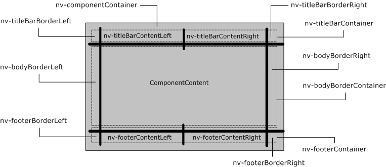
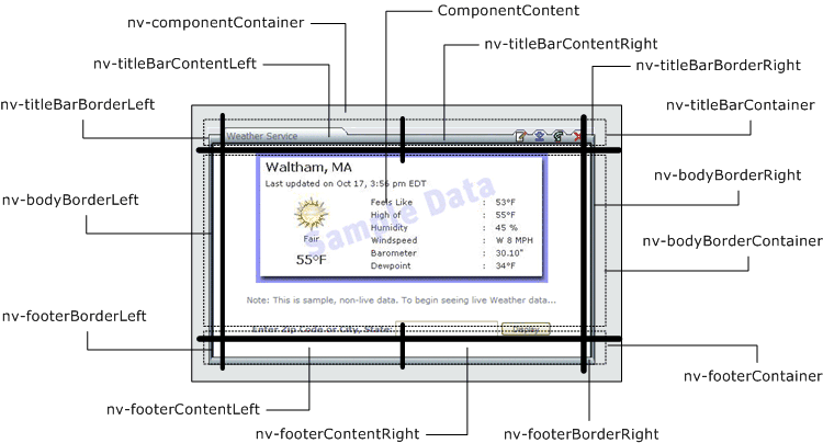
The CSS file for a theme divides the visual display of a portlet into several sections, as shown below:
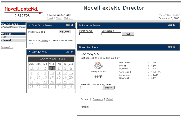
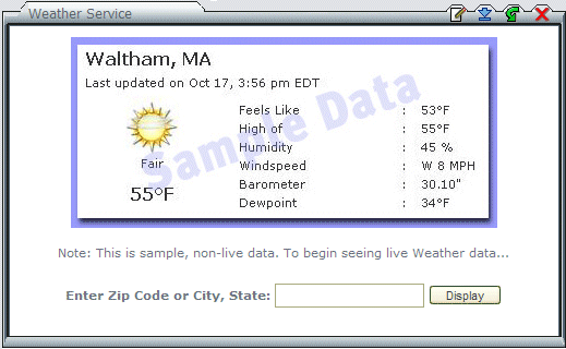
How does this display scheme apply to a real-world example? Consider the Weather Service portlet, displayed here in the Titanium theme:
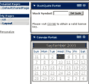
The following illustration shows how each display section of the Weather Service portlet is rendered in the Titanium theme:
The theme.css file for the Titanium theme specifies background images for most of the display sections for a portlet:
The exteNd Director API provides two interfaces for working with themes:
EbiThemeManager provides methods for accessing EbiThemeInfo objects. EbiThemeInfo provides methods for retrieving various kinds of information about a theme, including its display name and description. The EbiThemeInfo interface also provides access to the URIs for a theme's preview and thumbnail images.
To access an EbiThemeManager object, you need to use the getThemeManager() method on the EboFactory class for the Portal subsystem.
Copyright © 2004 Novell, Inc. All rights reserved. Copyright © 1997, 1998, 1999, 2000, 2001, 2002, 2003 SilverStream Software, LLC. All rights reserved. more ...