5.4 View Customization
This section discusses the customization of report views, specifically table and chart views.
5.4.1 Creating and Editing Report Views
Adding a View to a Report
-
From the Report Explorer, right-click the report template you want to customize and select .
The Edit Report Template dialog box is displayed.
-
Click the tab.
The Views page is displayed, showing any default or previously created views.
-
Click .
The Create View (Step 1: General Settings) dialog box is displayed.
-
Type a unique for the new view.
-
For views, proceed to Creating and Editing a Chart View. For views, proceed to Creating and Editing a Table View.
Editing a Report View
-
Select a view on the page of the Edit Report Template dialog box.
-
Click .
The Create View (Step 2: Customization) page is displayed for the view type selected.
-
For views, proceed to Creating and Editing a Chart View. For views, proceed to Creating and Editing a Table View.
Removing a View from a Report
-
Select a view on the page of the Edit Report Template dialog box.
-
To temporarily remove the view, deselect the check box. To permanently remove the view, click .
-
Click .
Creating and Editing a Table View
-
Select in the area and click .
The Step 2: Customization page is displayed.
-
On the tab, select the column titles to display in the report.
See Section 5.6.2, Customizing Reports for information on arranging columns, conditional formatting, column sorting, and summary rows.
-
Use the tab to create forecast columns in the report view.
Create forecast columns and display: Clear the check box if forecast columns are not required. When selected, this option enables the following column options:
-
Original Values: Displays the original values.
-
Change (%): Displays the percentage of change from the original values.
-
Change (Units): Displays the change from original values in units.
Forecasting is only supported in table views.
-
-
Use the tab to group rows in the table view. For information on report groups, see Adding or Modifying Groups.
-
Use the tab to add Matrix columns to the table view. For information on report matrixes, see Adding or Modifying Matrixes.
-
Click to add the view to the list of available views in the Edit Report Template dialog box.
Creating and Editing a Chart View
-
Select in the area.
-
Select a chart type from the drop-down list (histogram, scatter chart, or usage chart. For analysis reports only).
-
Select an expression from the drop-down list. The expressions listed vary depending on the chart type selected.
-
Click to display the view. For the histogram chart type, the Settings dialog box is displayed. Use it to set various options as described in Section 5.4.2, Histogram Charts.
-
Click .
The Create View dialog box (Step 2: Customization page) is displayed, showing the view.
-
For a chart, the Chart View Settings dialog box is also displayed. Use it to set various data, summary, and sort options as described in Section 5.4.3, Scatter Charts.
-
For an Analysis report, the chart type is also available. Select and click . The Usage View Settings dialog box is displayed. Use it to set various options as described in Section 5.4.4, Usage Charts.
-
-
Click to return to the chart-appropriate Settings dialog box and modify the specified options.
-
Use the various buttons at the top of the chart in the Create View dialog box to print or modify the chart.
-
Click .
The view is displayed in the list of available views in the Edit Report Template dialog box.
5.4.2 Histogram Charts
In the Create View (Step 2: Customization) dialog box, click to modify the contents of the histogram.
The Settings dialog box is displayed.
Figure 5-6 Settings Dialog Box
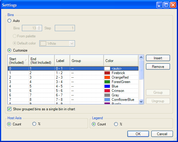
The default setting for the histogram includes five bins with a Step size of 1.
Auto
Select to specify a different number of Bins or Step sizes to be used in the histogram. Click to automatically generate colors for the histogram bars from the palette. Click to choose one default color for all histogram bars.
Customize
Select to modify the upper or lower boundaries of any bin needing modification. Optionally, specify custom labels and colors for the corresponding histogram bars.
Click the button to insert a new bin below the currently highlighted bin. The appropriate , , and columns are automatically adjusted to accommodate the new bin, which can be customized.
Click the button to remove the currently highlighted bin. The appropriate , , and columns are automatically adjusted.
Select any number of consecutive or non-consecutive bins and click the button to group them together. Enter the group's name in the column for any one of the bins. The name is automatically assigned to all members of the group.
Click the check box to display the grouped bins as a single bin in the chart.
5.4.3 Scatter Charts
In the Create View (Step 2: Customization) dialog box, click the button to modify the contents of the scatter chart. The Chart View Settings dialog box is displayed.
Figure 5-7 Chart View Settings
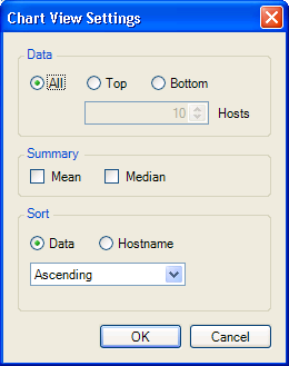
In the area, choose how much data to include in the chart. Select to include all data, or select or to limit the chart to the highest or lowest values of data. For or , specify the number of values, up to 25, to include.
In the area, select and/or to include those lines in the chart. These values are based on all data, not just displayed values.
In the area, choose to sort the chart in ascending or descending order according to data quantity, or alphabetically by hostname.
Click to display the chart.
5.4.4 Usage Charts
Usage charts are unique to Analysis report templates. In the Create View (Step 2: Customization) dialog box, click to modify the contents of the usage chart. The Usage View Settings dialog box is displayed.
Figure 5-8 Usage View Settings
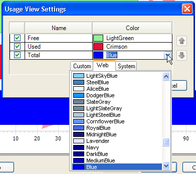
Use the check boxes to determine which bars to include in the chart. If desired, use the drop-down lists in the section to assign colors to the bars in the chart.
To move a bar to the left or to the right in the report, select it and use the up- or down-arrow. Click to display the chart.